Brief
Encourage culturally engaged young people to experience ballet for the first time.
Come up with a creative concept that dispels the preconceptions and celebrates the beauty and emotion that balelt brings to the stage, something that challenges our target audience to look at ballet as an art form that could be a new love in their lives.
Insight
People have many preconceptions about ballet and why it is not for them.
A key one is that they don't understand it.
"Because ballet deals with the big human themes, life, love, death, loss, passion, joy, anger, humour, it's relevant to everyone, and everyone can understand it".
I want to encourage people to see ballet in a different way to how they saw it before.
After all dance is just a form of communicating.
In particular I want them to see it as a form of expressing emotion, because we can all ready body language.
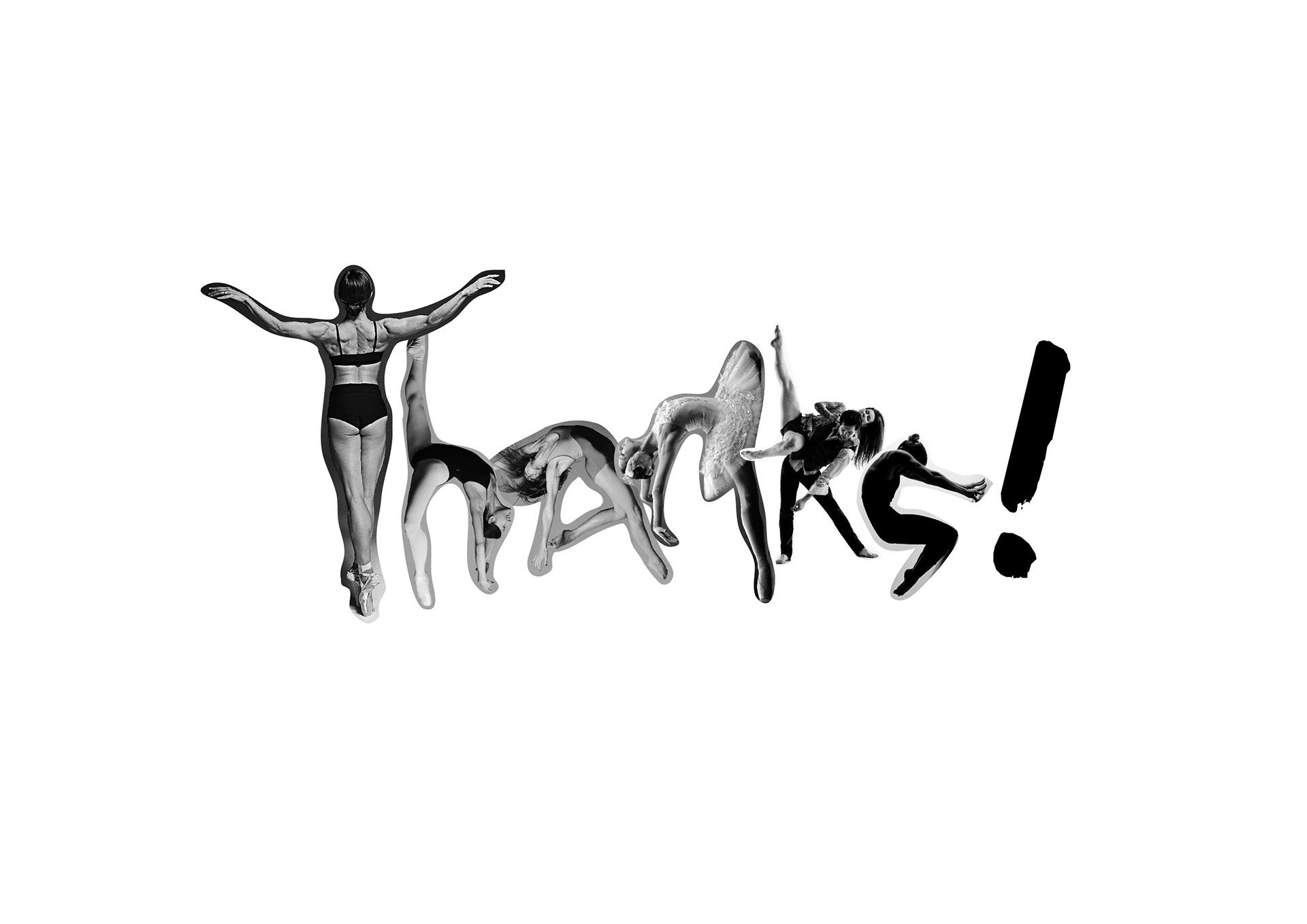
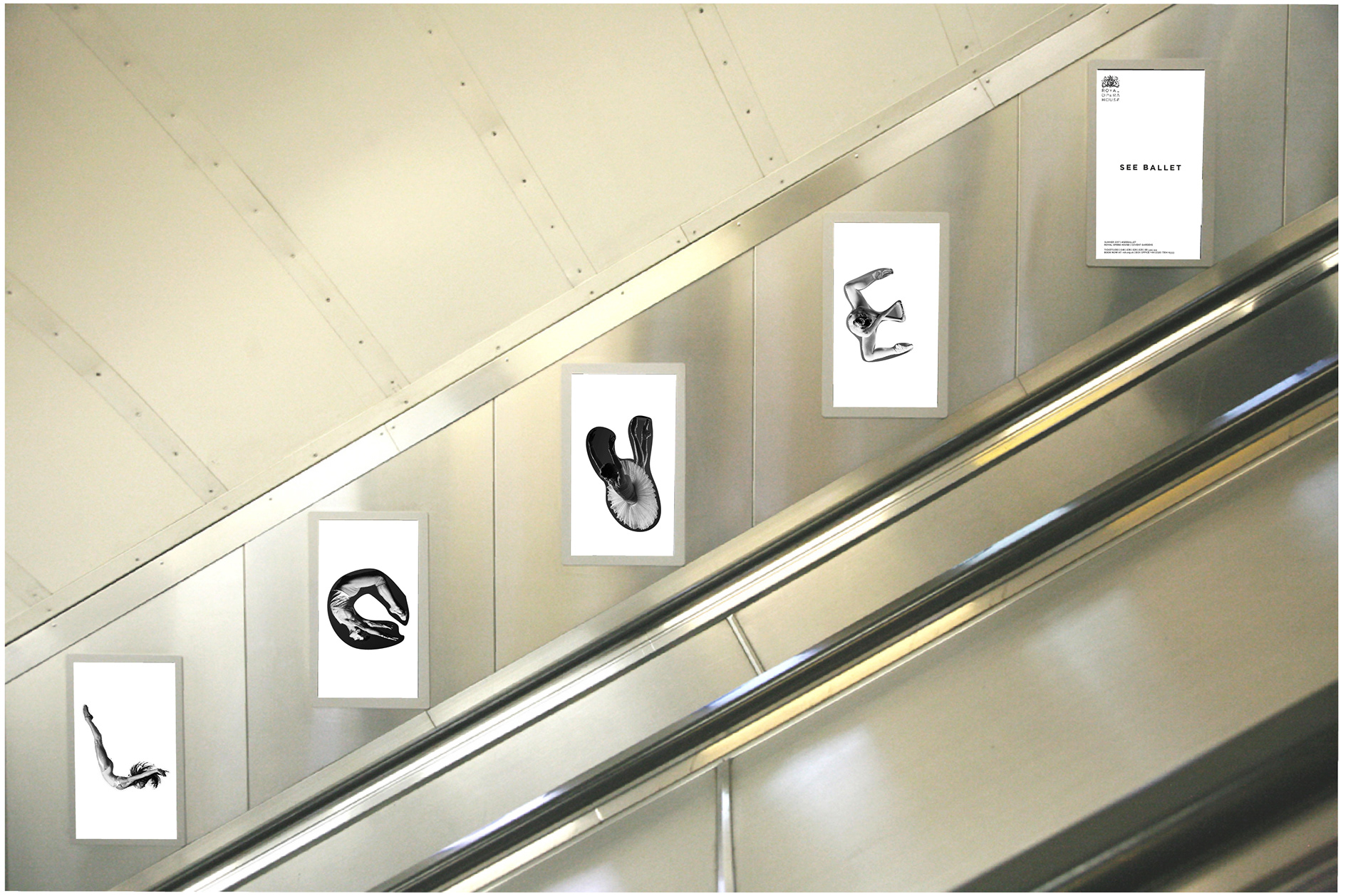
Developing a 'body language' - literally. I developed an alphabet using photography of ballet dancers. This will now act as a tool for spelling things out.
I chose a collection of key words taken (mainly) from the brief to form the messages for the campaign which are all based around the theme trying something new. “Somebody must always be doing something new, or life would get very dull” The messages are tied together with the call to action: See ballet
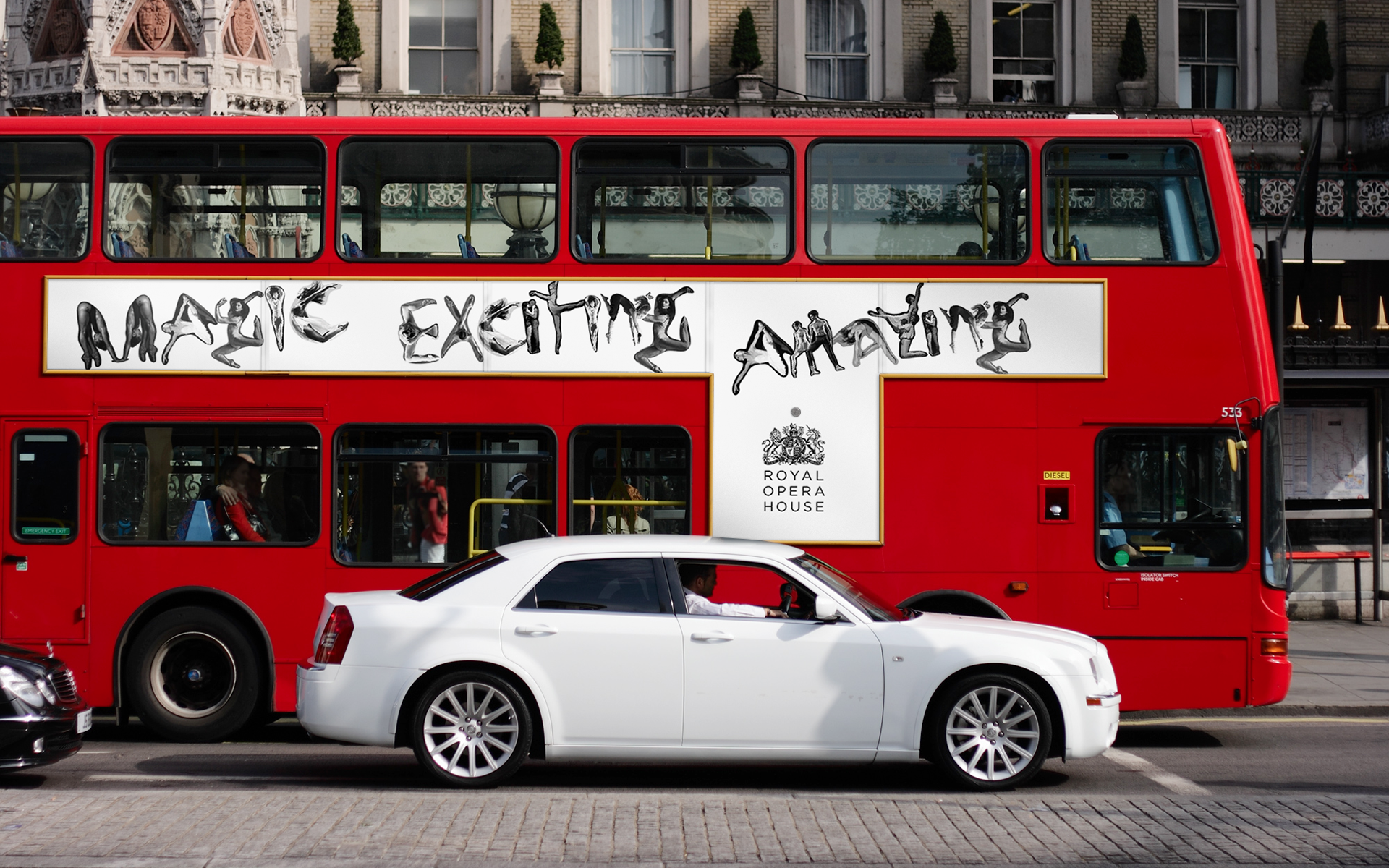
The use of handwritten type creates a feeling of movement and energy and of playfulness. It’s more friendly than intimidating. I have limited the artwork to black and white in order to simplify the overall message. The body forms combined in this manner is an unusual and refreshing approach to ballet advertising. The simplest way of dispelling a misconception and getting the attention of a new audience is by doing something radically different to what they’ve seen before.
I chose a collection of key words taken (mainly) from the brief to form the messages for the campaign which are all based around the theme trying something new. “Somebody must always be doing something new, or life would get very dull” The messages are tied together with the call to action: SEE BALLET
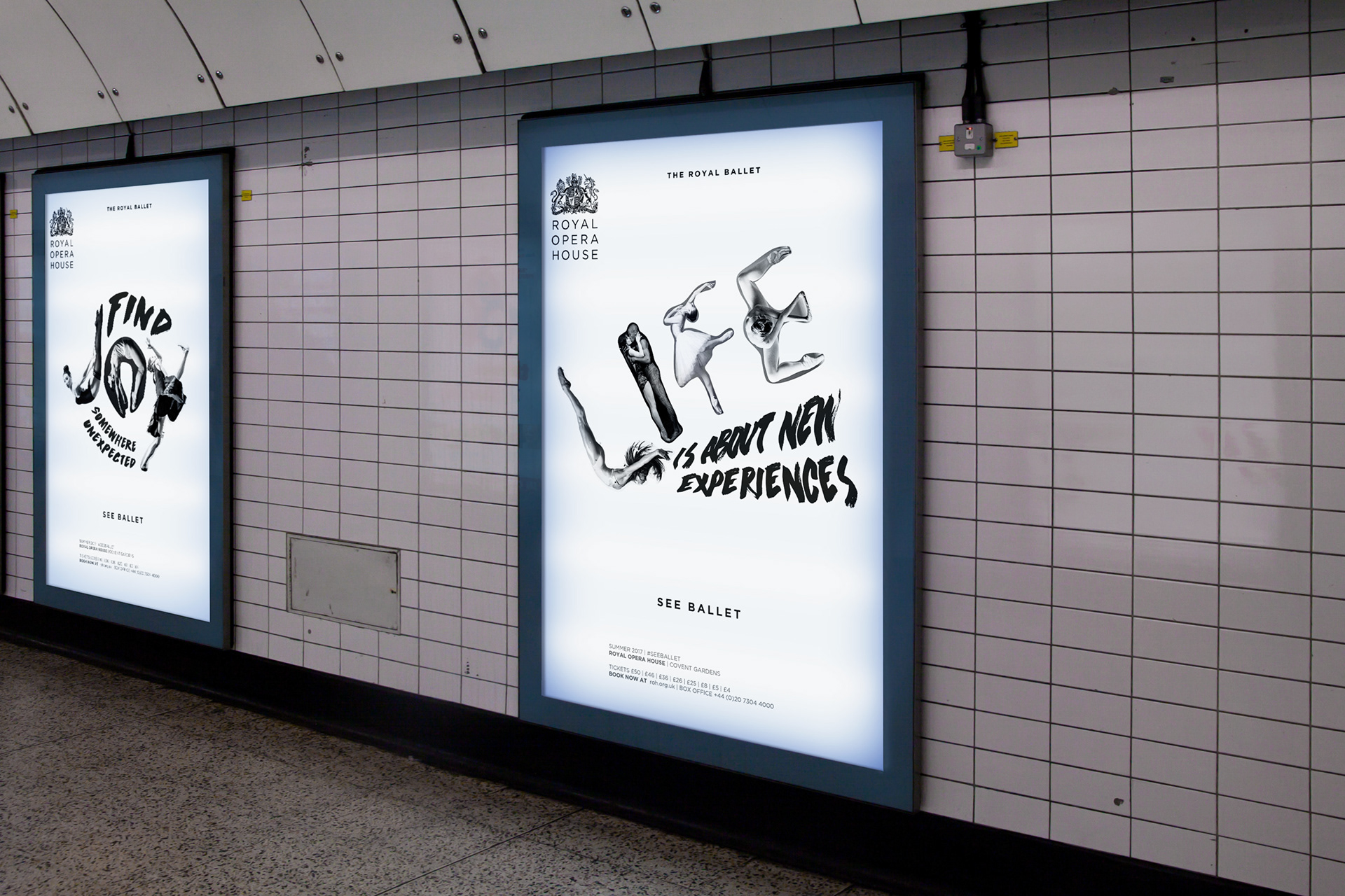
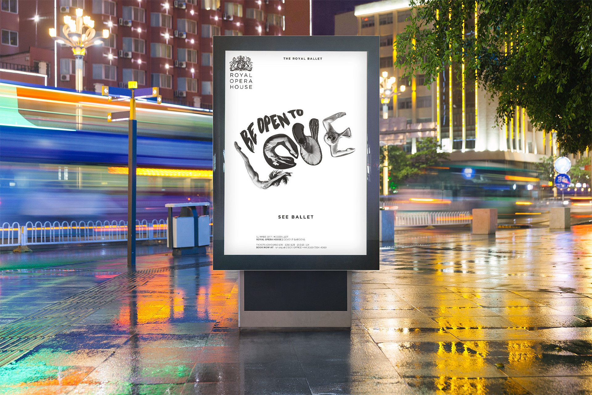
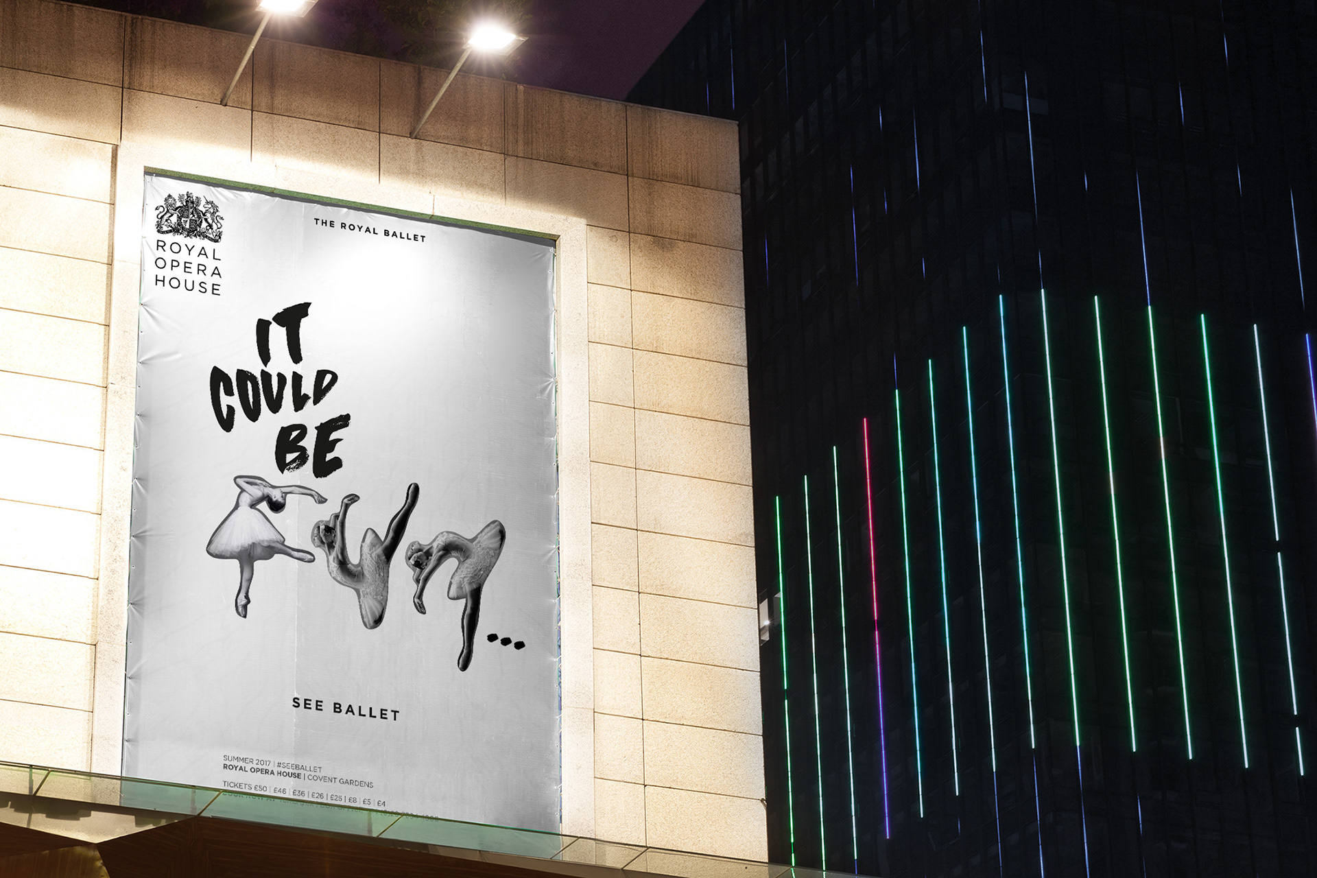
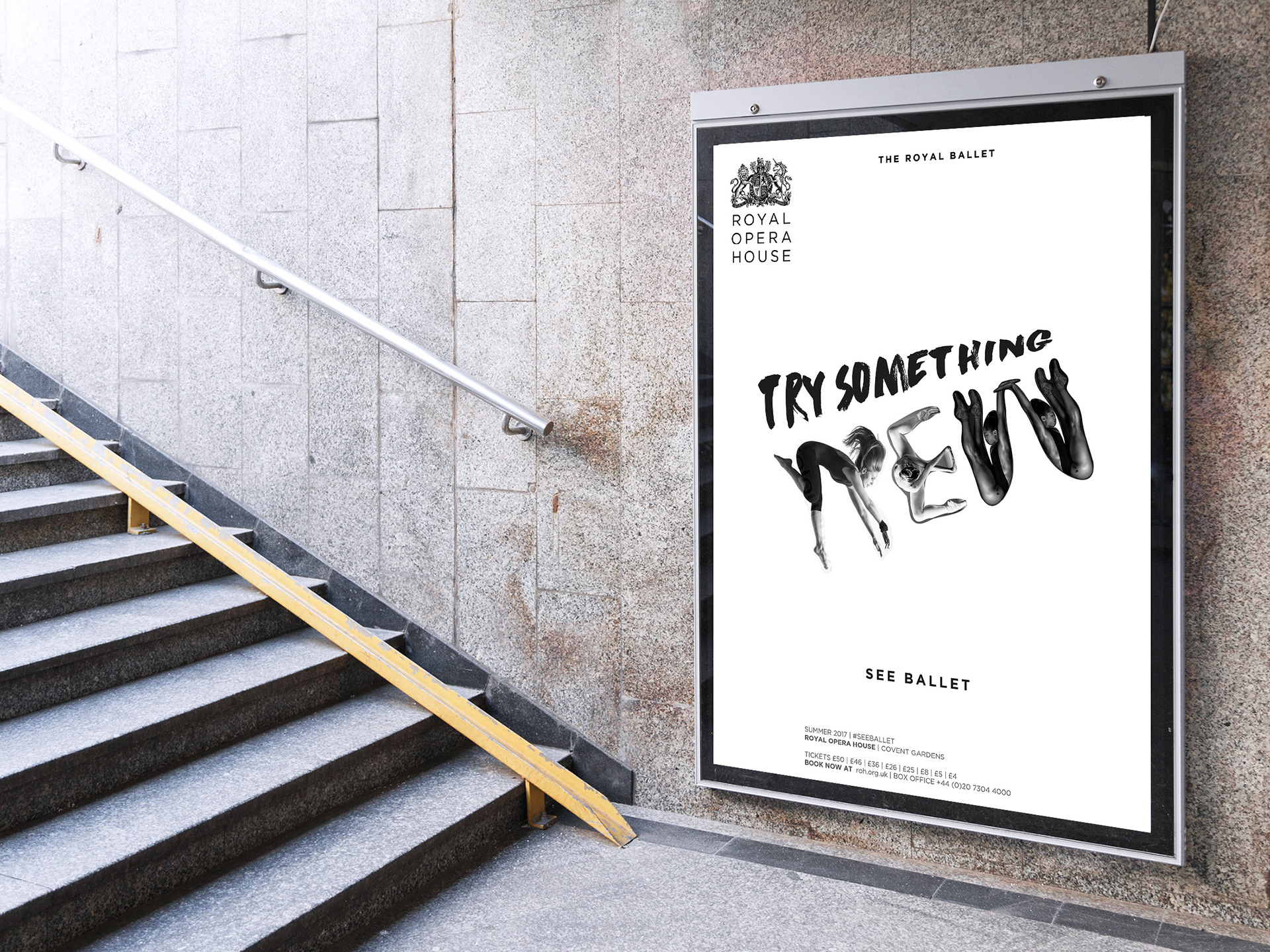
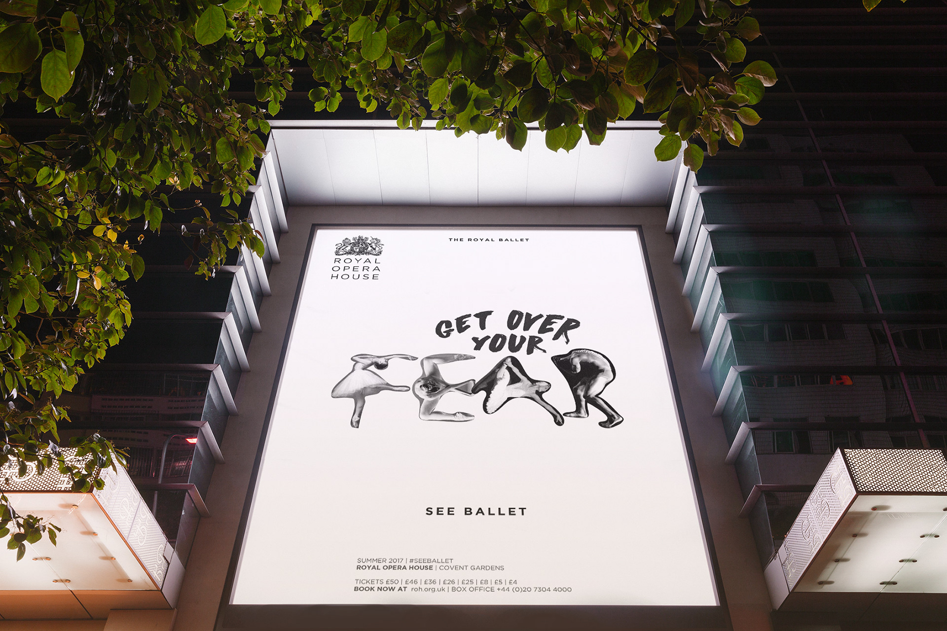
Everything about the visual appearance of the campaign is different to what you might expect a ROH campaign to look like. This is intentional. At first glance you wouldn’t think the posters were advertising ballet. To be frank, the dancers’ forms, some of them intertwined, combined with the language which advocates trying new things, could almost look like a campaign to spice up your sex life. This was a happy accident, it may be a bit risqué but I think perhaps that’s what the ROH needs. The mix of handwritten type and colloquial language is also intentional - changing the tone of voice. In order to attract a younger audience, a more informal tone was adopted.
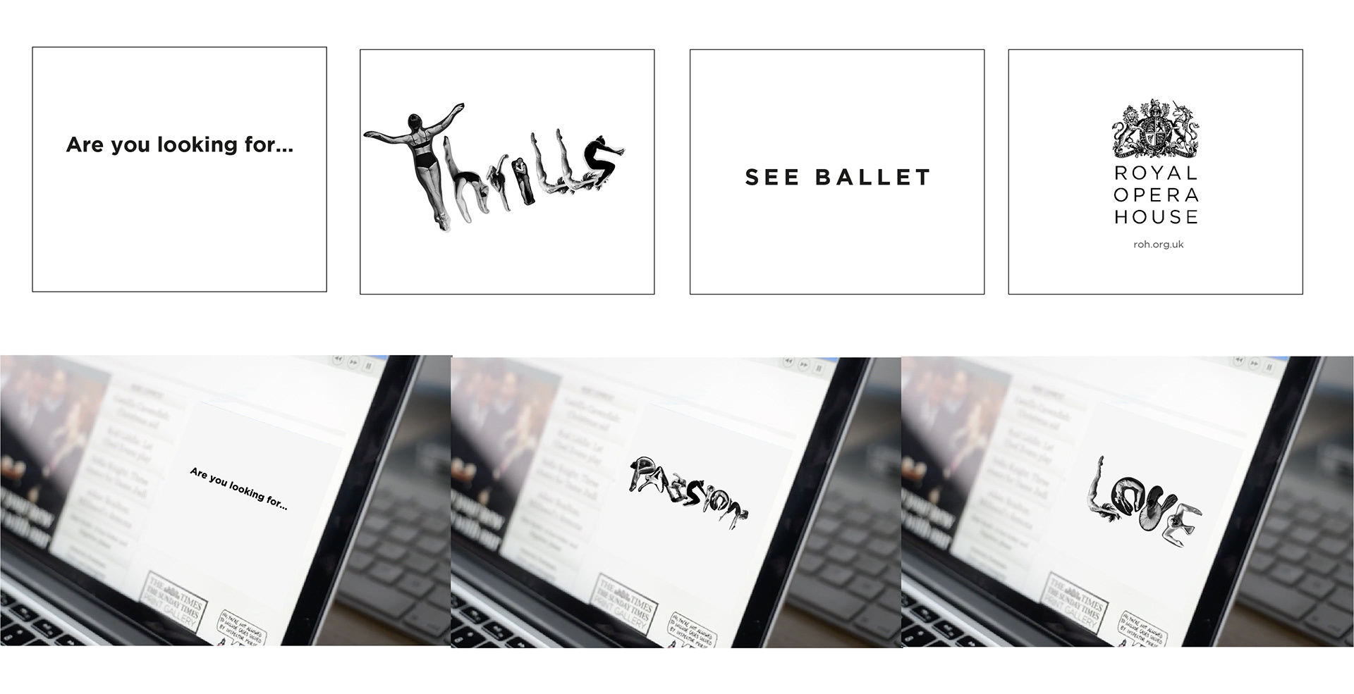
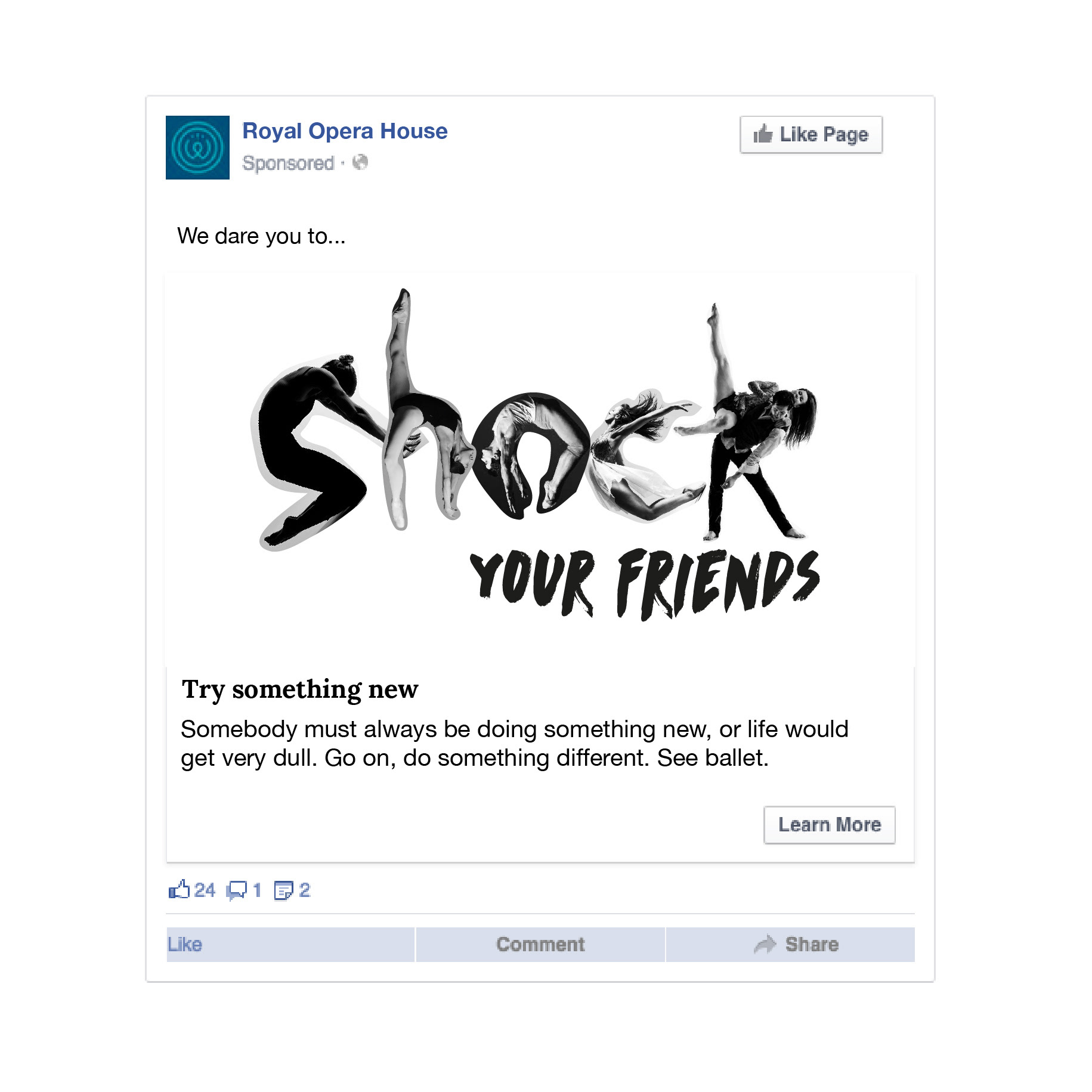
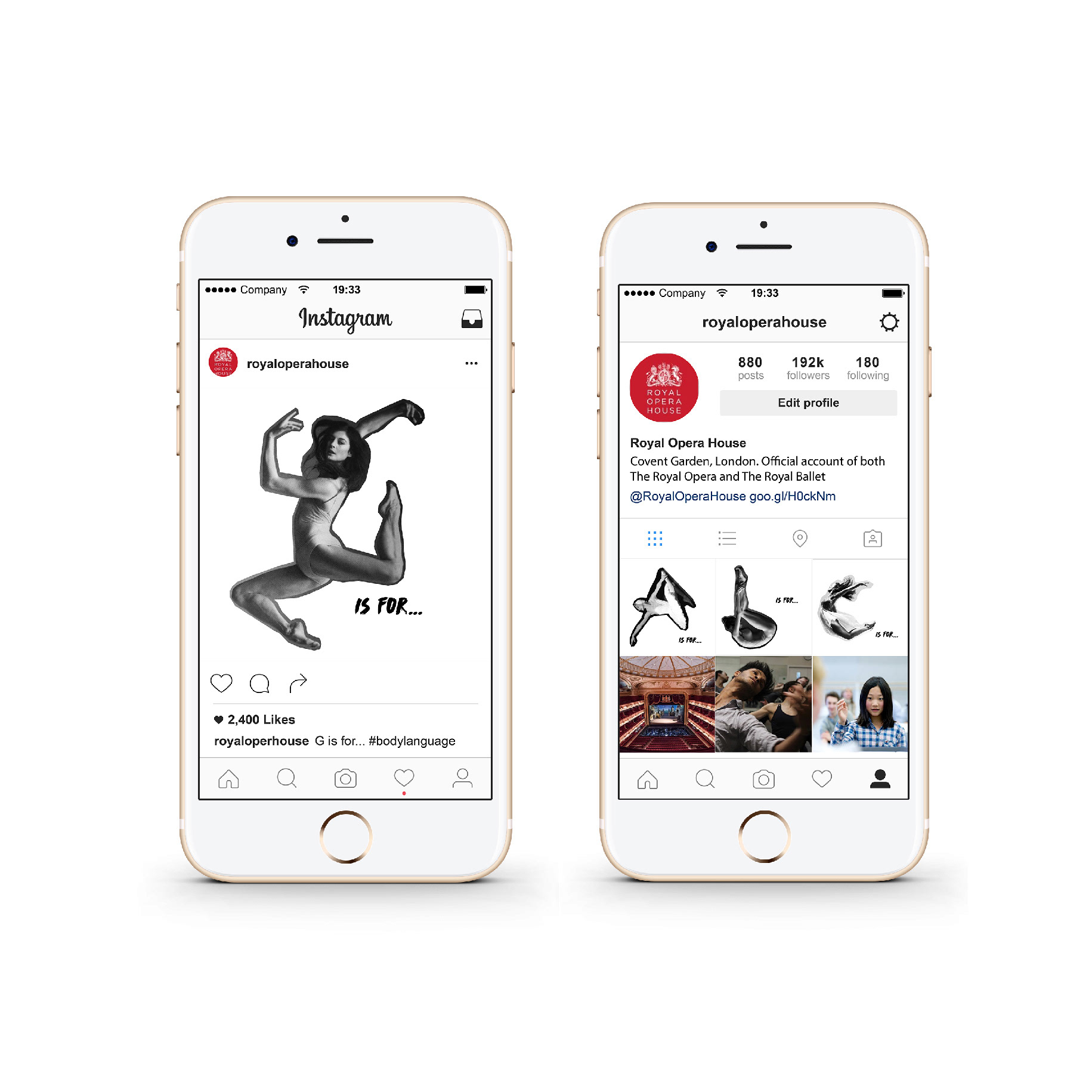
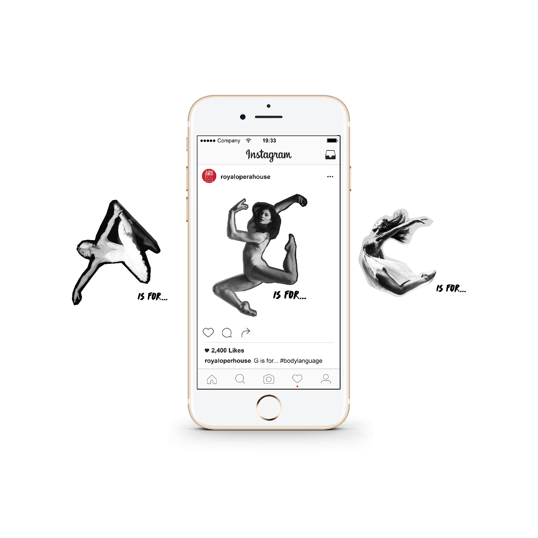
Letters from the ‘Body Language’ could be used in multiple ways. Ballet A-Z for example. G is for... Giselle, grace. Or ROH could use a letter of the alphabet to correspond to events/time of year/theme etc. i.e S is for Summer and then announce happenings. There are many possibilities.
I believe that I have created a striking campaign which celebrates the beauty and emotion that ballet brings to the stage. In many ways it challenges preconceptions, makes people see ballet in a new way and speaks directly to the target audience challenging them to try something new.
