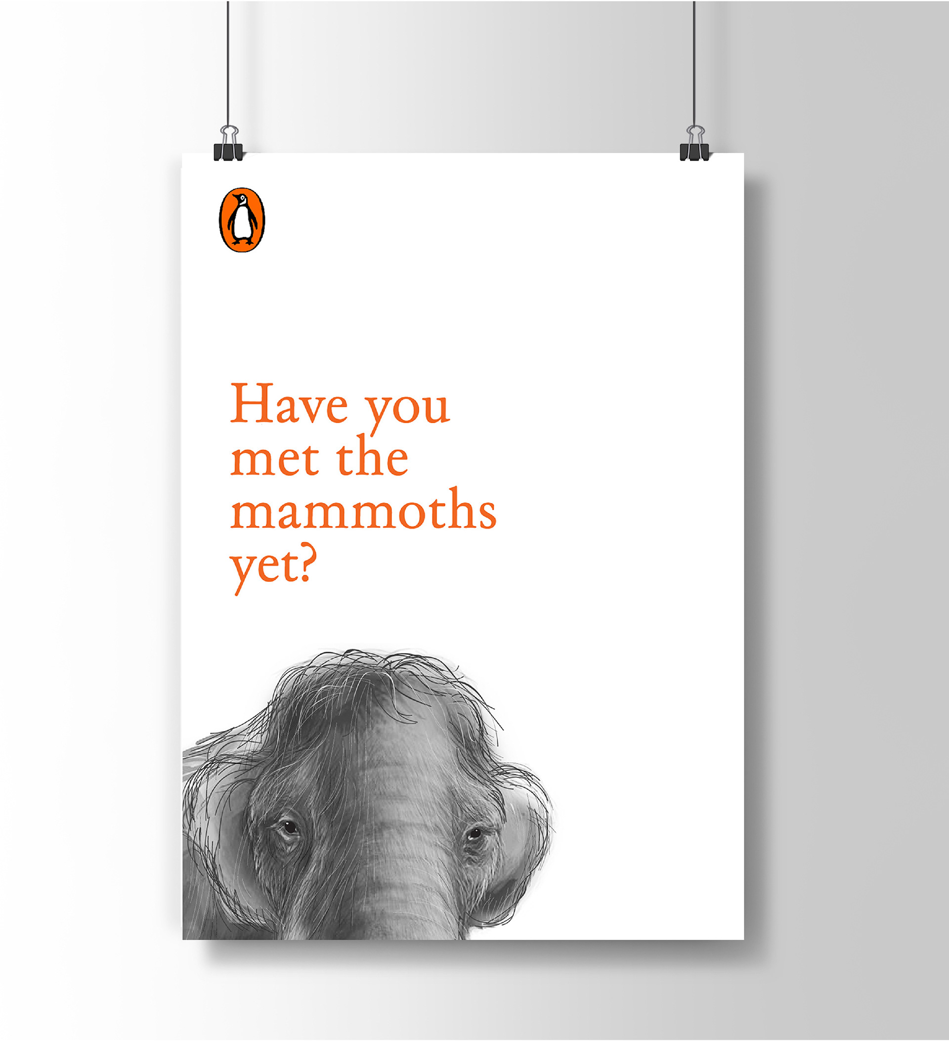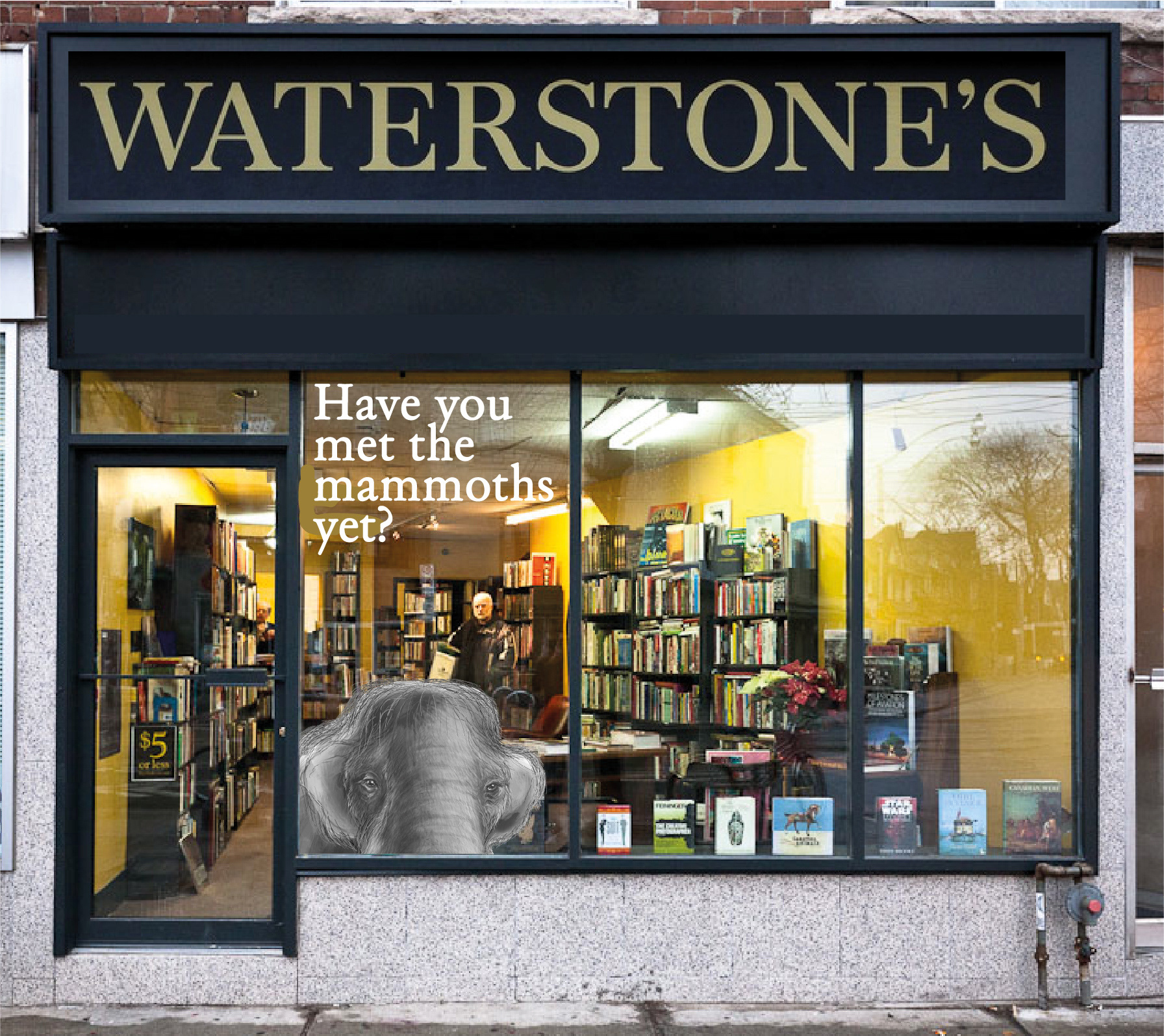
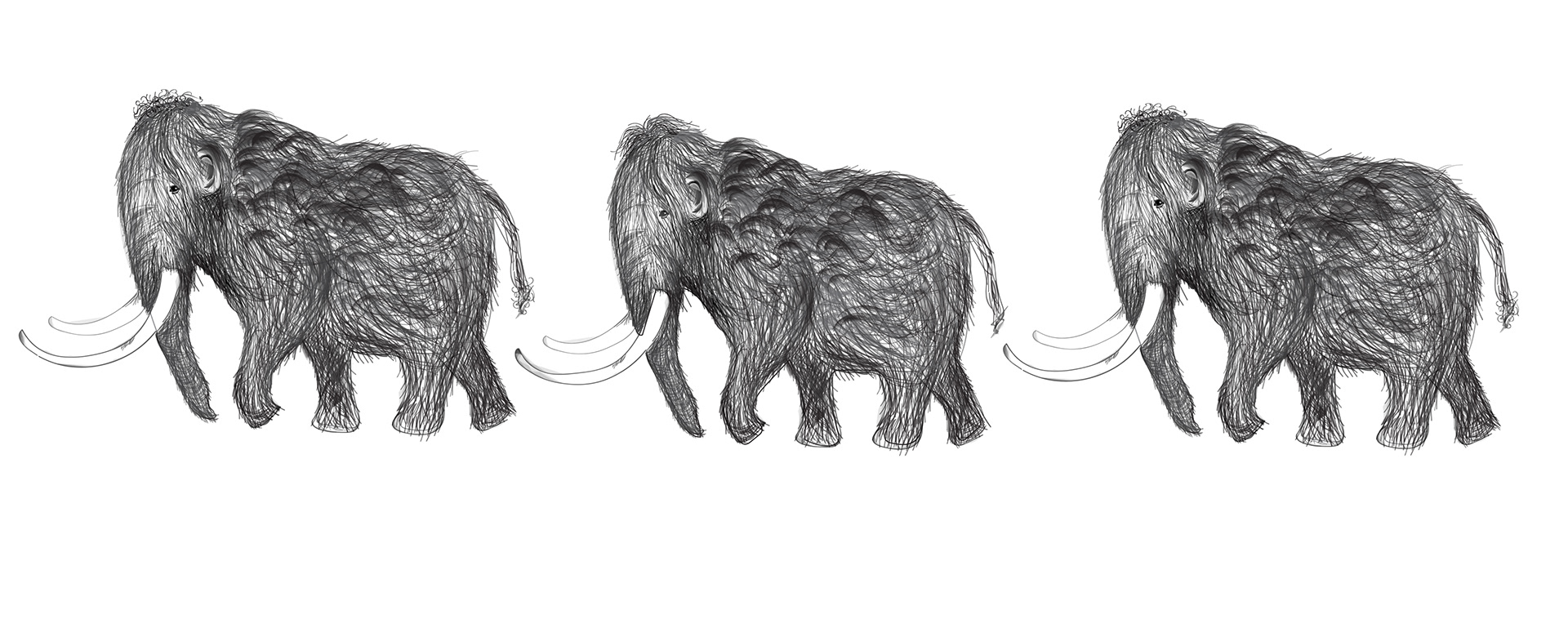
I illustrated the mammoths. I wanted to make them looks like soft pencil drawings, or like illustrations that would be found in a children's story book to tie in with the idea that 'mammoth reads' are 'not as scary as they may seem'.
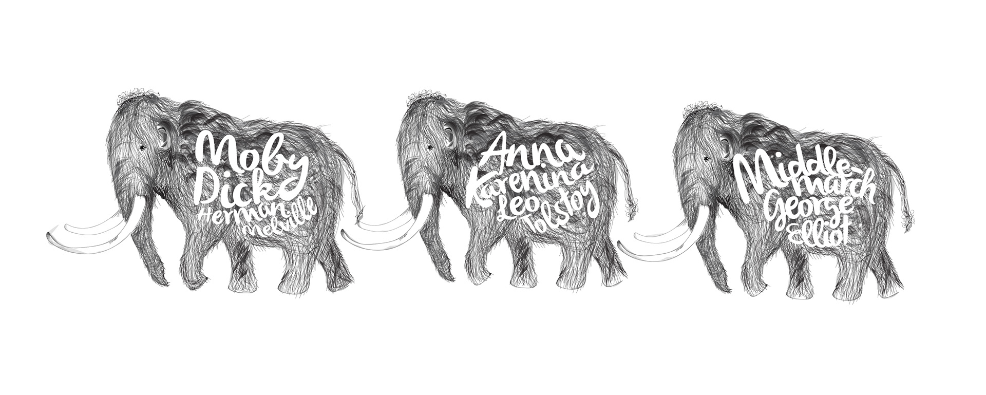
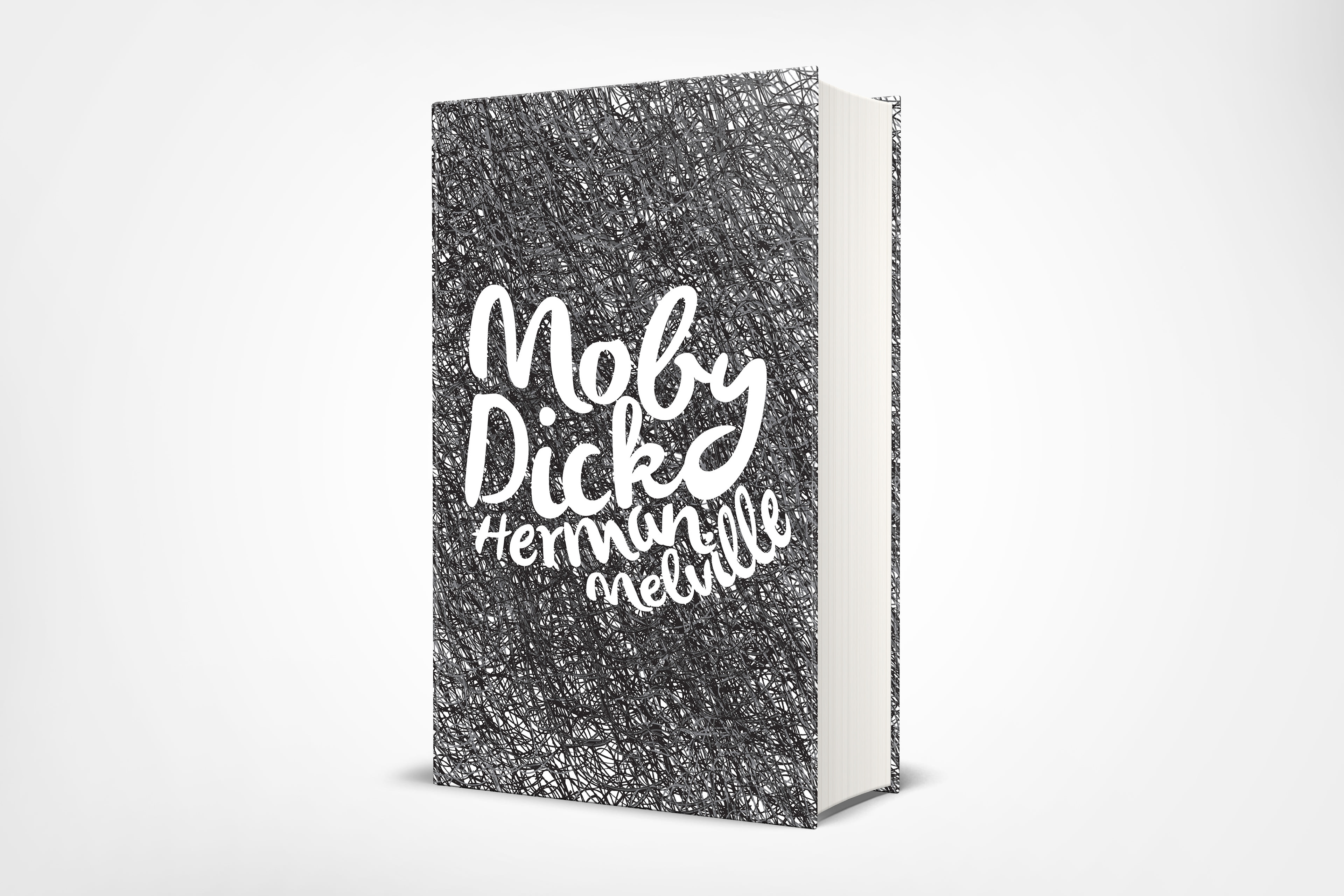
I then used a hand drawn style font to create the titles for some of the books within the 'mammoth reads' collection. I wanted to stay away from any typical or formal styles of font because I wanted to tie in with the playful theme. I think the font I chose feels quite alive, like the mammoths themselves.
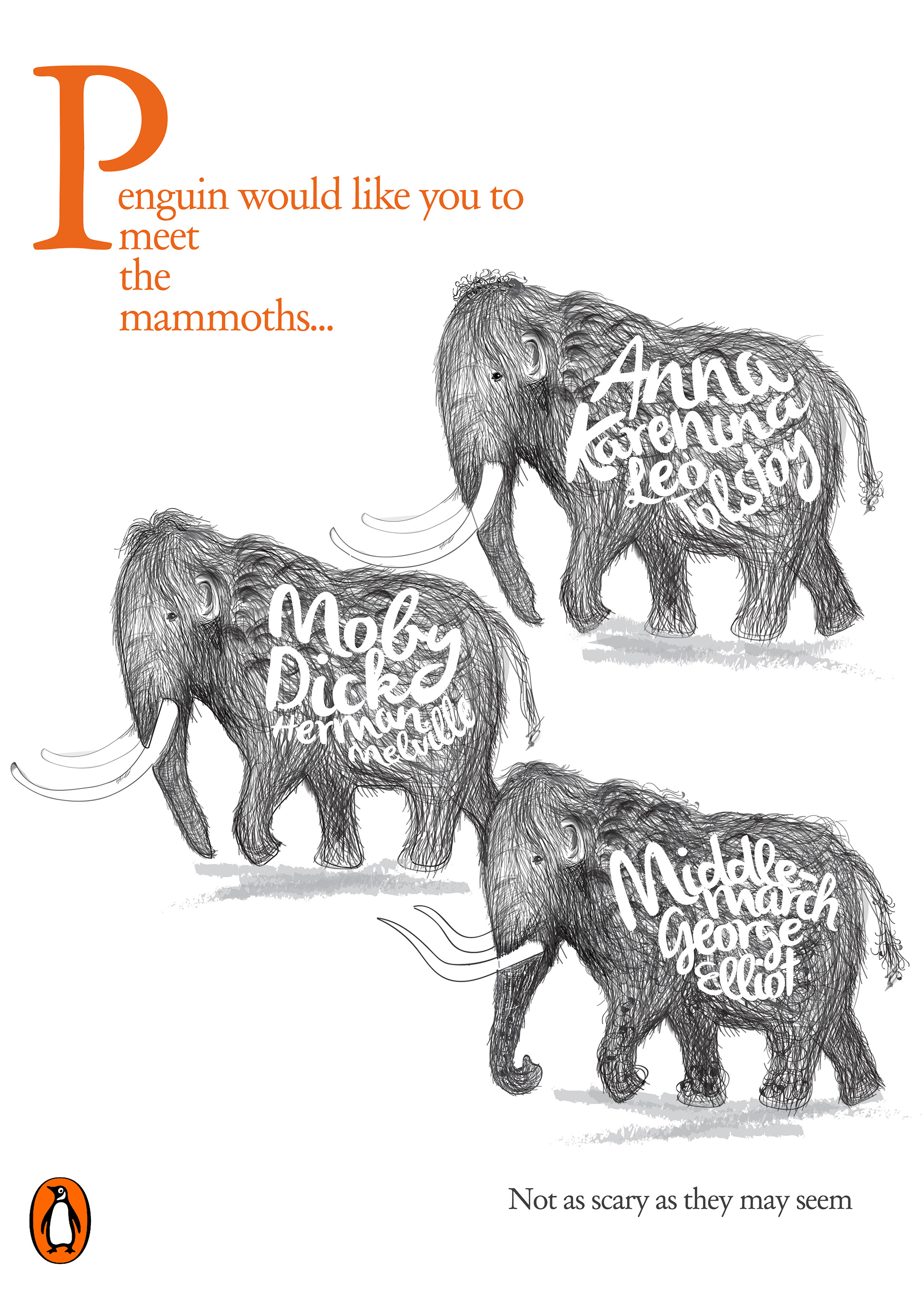
Some examples of what posters could look like - using the illustrations I created previously. I made the copy 'Penguin would like you to meet the mammoths' as an introduction to the campaign. I used an exaggerated drop cap, reminiscent of the beginning of a chapter or a story.
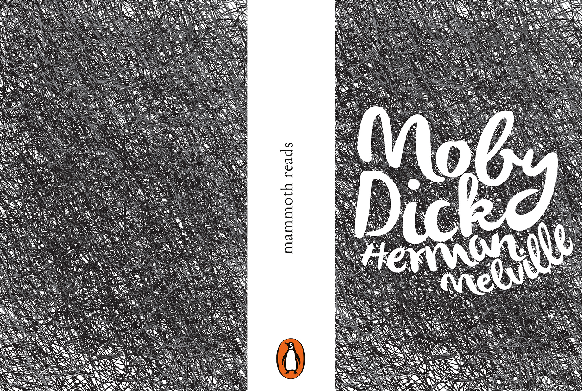
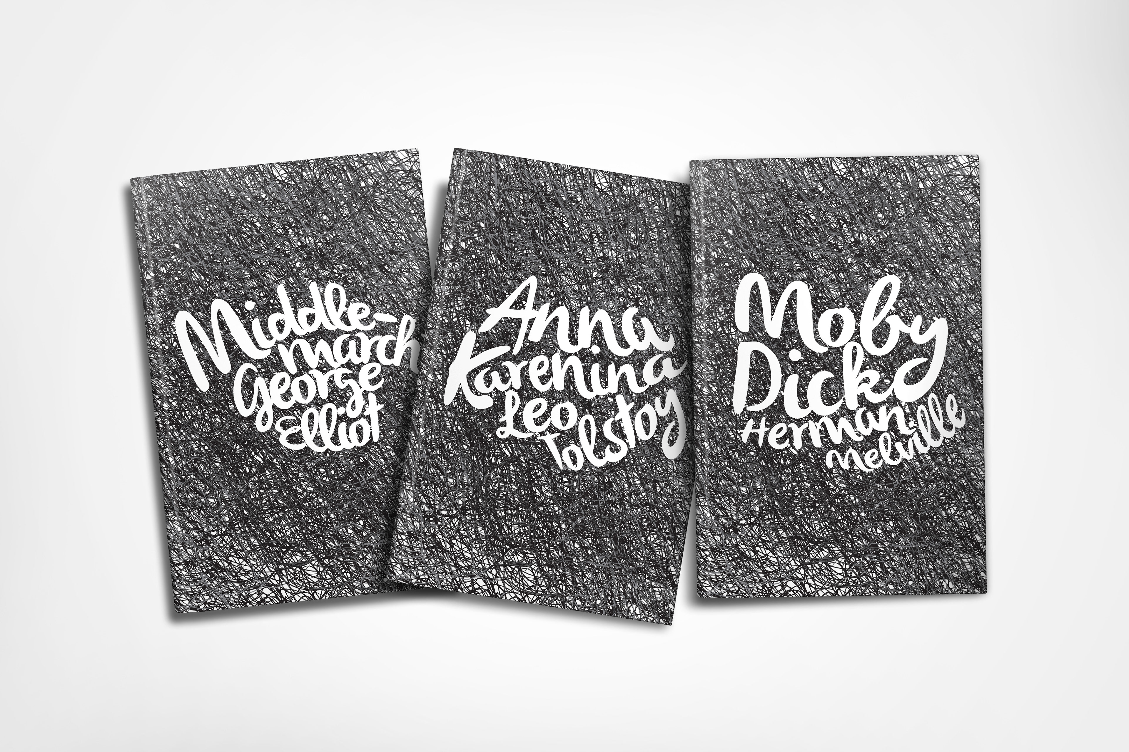
I wanted to continue the theme and have 'Limited Edition' book covers which would encase the books original covers, for the duration of this campaign. As you can see they are simple and just reflect the texture of the mammoths' wool and the typography as featured on the mammoths' bodies
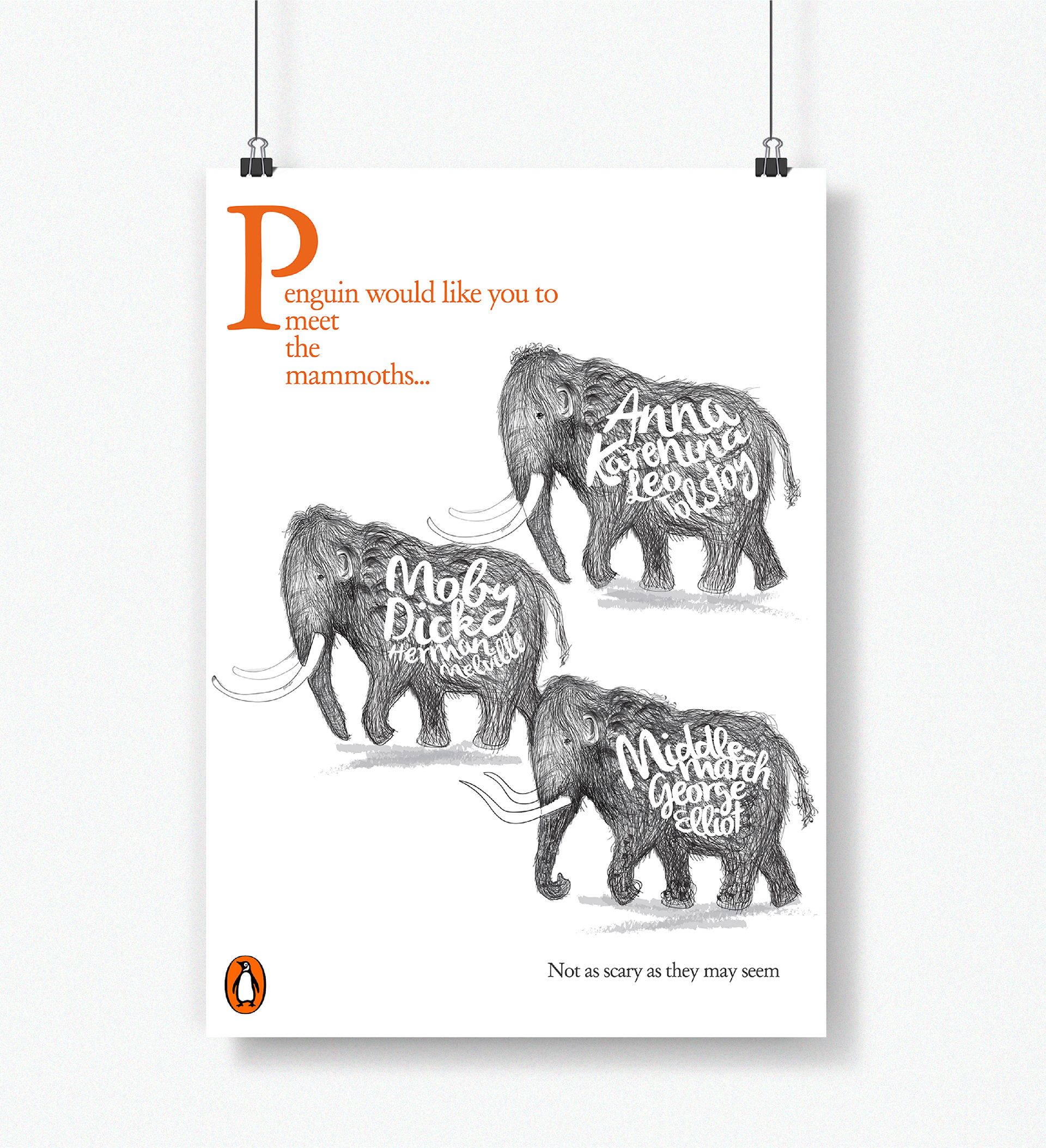
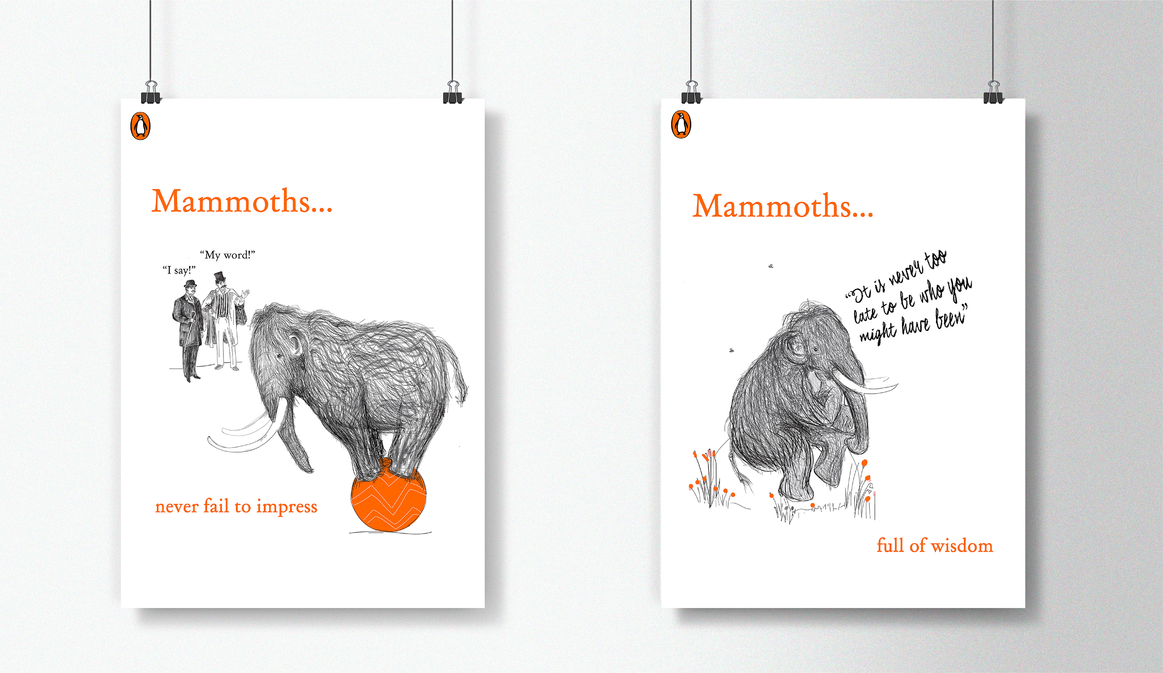
I created a series of campaign posters which are promoting the benefits of mammoths - i.e the benefits of reading one of the books in the collection of 'mammoth reads’
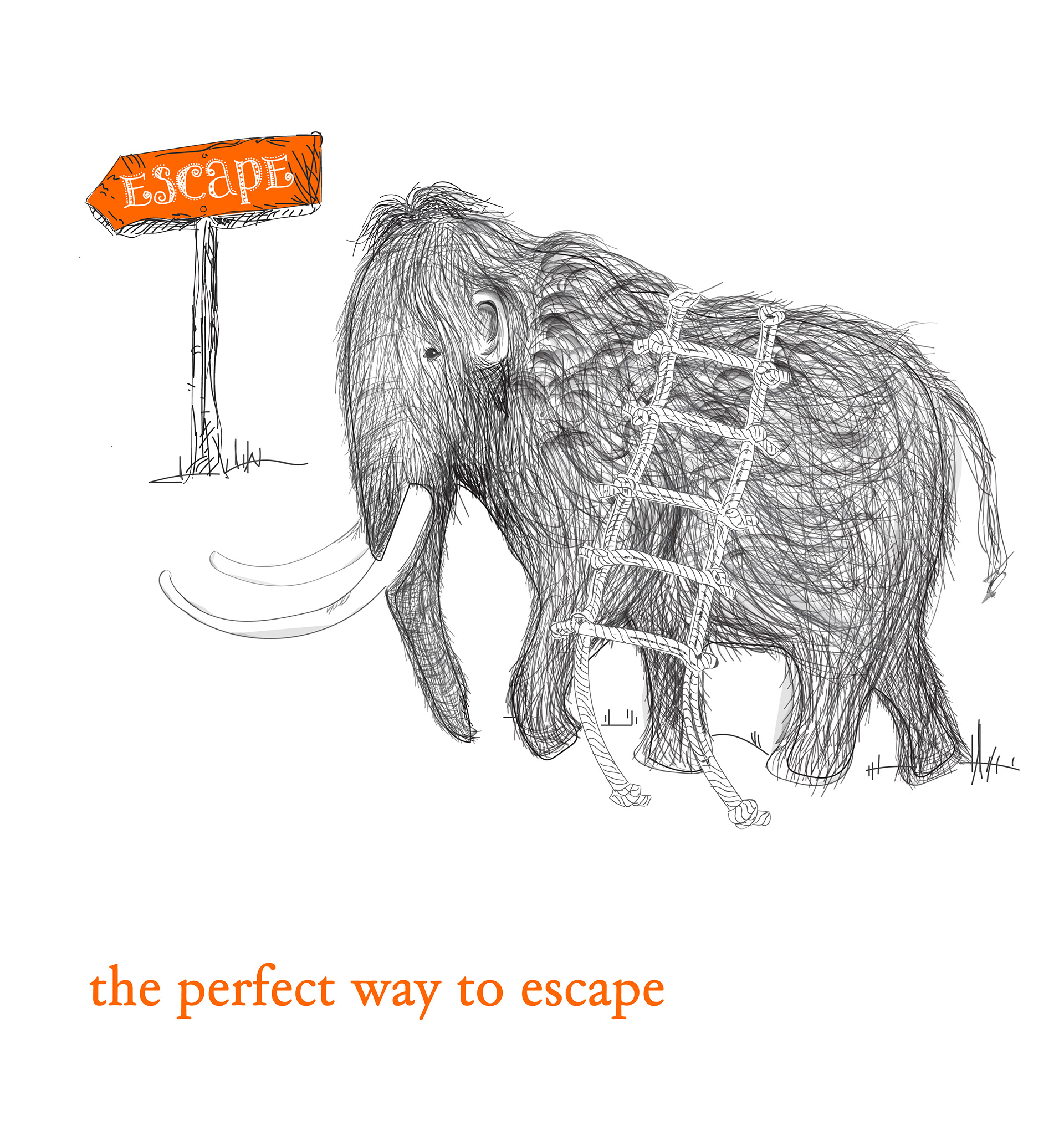
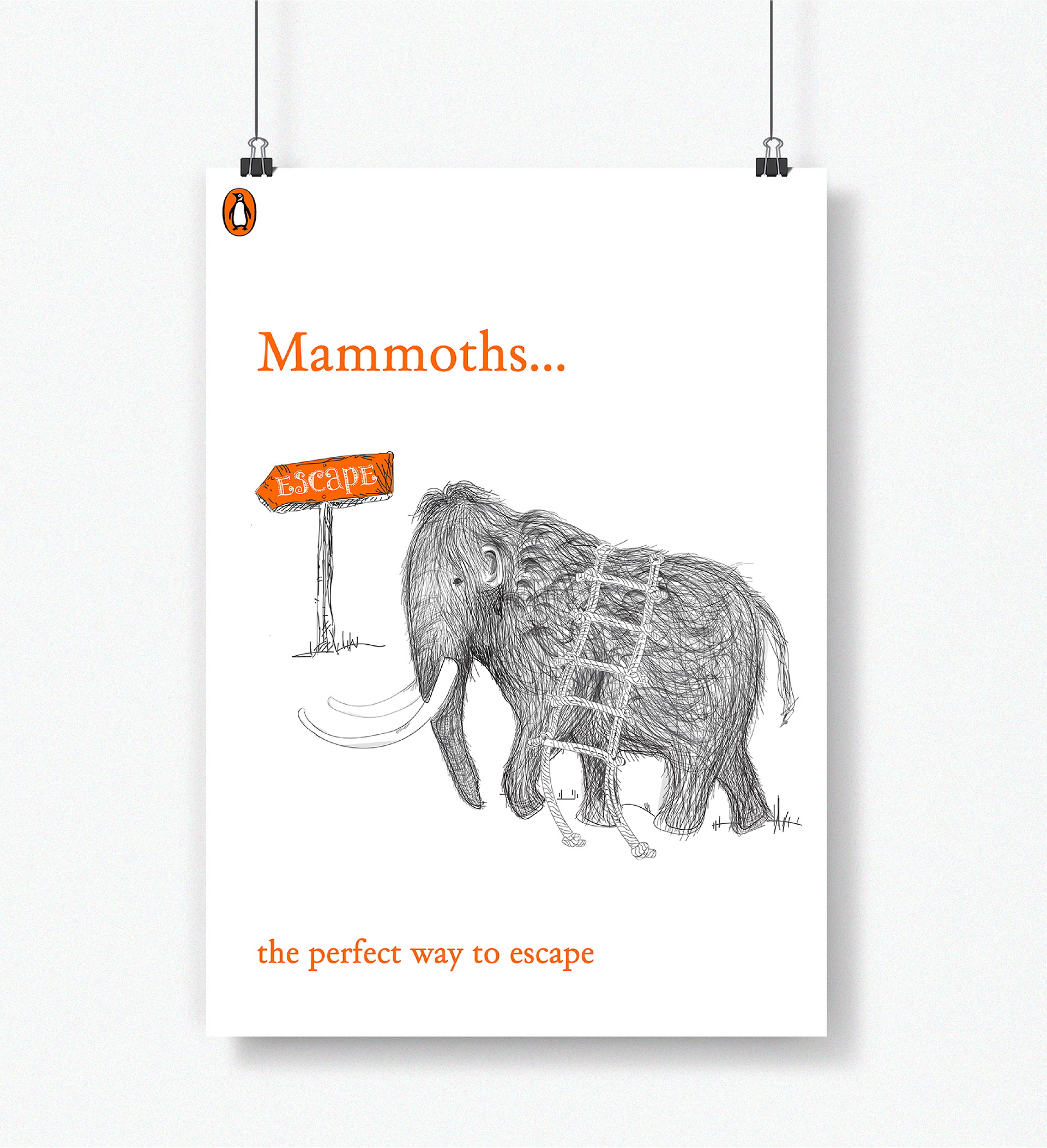
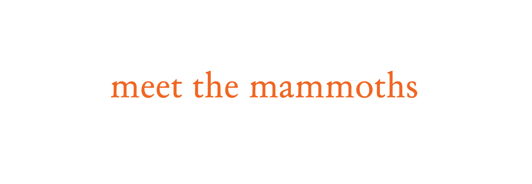
I also created some 'teaser' type posters which could be used on storefronts of bookshops or could work as online advertising on social media.